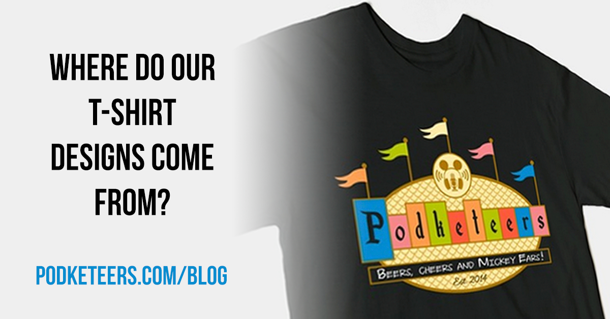
In short, our t-shirt designs are parodies of things that we individually love (not limited to Disneyland). This includes our Disneyland Marquee logo shirt called “Throwback Flags”.
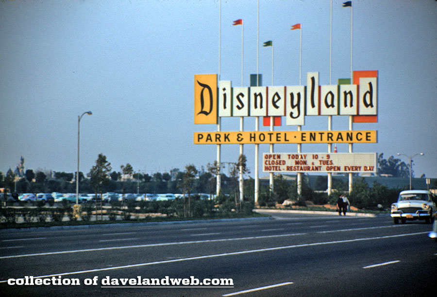
For years the classic Disneyland Flag Marquee was a warm welcoming reminder you that you’re about to enter the “Happiest Place On Earth”. The photo below is from one of the largest online collections of historical sites, DaveLandWeb.com. If you’ve never been to Dave’s site you definitely owe it to yourself to check it out (plus Dave is a super nice guy that some of us met back in May)! Dave recently started an Instagram account with some amazing photos! If you’re not following him on IG here is the link to his account: @davelandweb
The Disneyland Marquee stood as shown above until the late eighties when it was replaced by an updated snazzier looking version. The newer marquee ultimately met it’s demise during the park expansion that brought us California Adventure. Earlier this year we saw a poster for the opening & dedication ceremony of Disneyland while doing a “vintage Disneyland poster” search on Google. After seeing the poster (below) we thought it would be a nice homage to the place that we love so much to have our name displayed in the same manner. We’ve even seen at least one Social Club pay the same respect to this classic landmark.
Update (8/3/2015): The Disneyland-inspired poster below was created by Christopher Little back in 2007 as part of a school project. The link below (or click on the poster) talks about his background and why he was inspired by the park we love to create this poster. You can also check out his other website SimbaSpot.com.
DisneylandCaliforniaRe(p)ort -> Disneyland Poster, July 17 1955
Recently we were accused of “stealing” the marquee logo. Not by Disneyland but by other Disney fans. To be clear, we don’t claim to own the rights to the marquee logo which is owned by the Disney company. The accusing party went as far to say that it was rude that we were taking everyone else’s logos and using them as our own. The majority of our t-shirt designs are not meant to be permanent replacements of our logo but, again, a parody of things that we love. Plenty of people create parodies of things that they enjoy, like the Starbucks logo. A simple search on several popular DTG (direct-to-garment) websites will show proof of that (like TeePublic, the company that we use to print our shirts).
We were made aware that a “nicely worded email” asking us to “retire” that particular design was sent to us a couple of months ago. We’re not sure what email address this message was sent to but we can tell you that all of our emails are managed via Gmail. After several extensive searches we found nothing regarding the email in question. We were accused of not even responding to the email but how can we respond to something that doesn’t exist? Please keep in mind that we are not accusing anyone of not sending this email or even making it up, we’re simply saying that we never received it. Once again, the design wasn’t created to put anyone in an “uncomfortable situation” or frustrate anyone. As stated above, the majority of all of our designs are parodies of things that we enjoy and it was simply created as an homage.
In order to put this issue to rest and as a sign of camaraderie we will indeed retire the original version of our “Throwback Flags” design. Please keep in mind that we are not retiring the design because any one party is “right”. We’re retiring it because the Disney magic that compelled us to start a Disney-inspired podcast isn’t about arguing over a design that stood over Harbor Blvd for decades or even making anyone feel uncomfortable. Whether via a podcast, a YouTube channel, a blog, your art, your music or photos on Instagram, we all have different levels of Disney fandom and we all experience the Disneyland resorts in different ways. Will ideas overlap? Certainly. These mediums are simply a vehicle to express our respect, our love and admiration for Walt and our love for Disneyland.
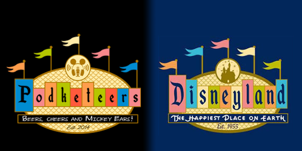
If you own a t-shirt with the now “classic” version of our “Throwback Flags” design, congratulations! You now own a limited edition shirt! 🙂 To replace it (and “avoid any confusion”), we would like to introduce the updated version of the design called “Marquee” along with the image that inspired it:
The new design is available now in the Gear section of our site (or by clicking on the image above). Thanks again for all of your support!

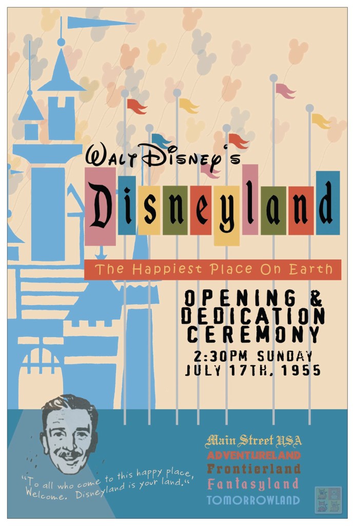
First, let me share with you that the Disneyland “Opening Day” Poster is my original work, originally conceived as a design school project in 2007. The project was to create a new album cover, poster, magazine from any historic period, utilizing the appropriate look through modern tools. As an OC native, former DL cast member and Disney fan, my topic was easy to identify: A Disneyland Poster in a 50’s silk screen style. Every element on the poster was hand made by me (except Walt’s face, an image from Kevin Kidney & Jody Daily), based on my favorite icons from the park. While I feel the poster is amazingly successful and genuine looking, remember that the attractions posters of the day were all for more than a one-time event and furthermore, the original font was a little less refined in the first few years… and finally, the iconic Disneyland Marquee didn’t even exist until 1958.
This images runs a fine line regarding how I can personally profit from it, although if I chose to, I would have to remove the face of Walt for sure. Instead of profiting off it in any way, I merely posted it online, and follow it’s exploits… seeing who tries to claim it, who tries to profit off it, and who tries to alter it… rather than be irritated, I just gotta smile. (It is my own version of Flat Stanley, I guess)
Because I no longer live in SoCal, I find I can still enjoy Disneyland through my series of images. I have been collecting images from the web for at least 15 years that have historical context especially those with attraction layouts, A-E tickets, guide books, maps and marquee signage in order to help visual define and unify the history of the Park as no one else has thought to do. I utilize photos from a wide variety of sources, including the awesome Davelandweb to play detective so that I can be accurate in recreating history series of ticket books, park layout, the marquee, etc and share my collections on my website SimbaSpot.com/MouseChow and my blog, the DisneylandCaliforniaRe(p)ort (which is where you might have found my Opening Day Poster, watermark in the lower right corner and all).
So then, I just wanted to write in order to say that as the owner of the Poster you have presented, as the elements I created are concerned, I have no problem with any inclusions or references you might currently be making, so long as they are used in a fandom sort of way, and not as a major for-profit venture.
Christopher
PS. Ironically, the reference photo for your new shirt design is actually the same image inspiration for my Opening Poster color palette—the colors behind each letter of the word Disneyland match on both!
Christopher,
Thank you so much for reaching out! First off, well done! The poster looks fantastic and definitely gives off the vibe of that 50’s silk screen you intended; I hope you got an ‘A’! 🙂 I know a lot of our listeners also enjoy seeing works inspired by landmarks, characters, and other Disneyland related things so I’ll update our post to include your name/blog so others are aware of who designed this poster. It’s always fun to learn new facts about the history of Disneyland and how it inspires the work of others! Until my own research this poster could have fooled me (regarding the marquee not being there opening day).
15 years of collecting images is a long time! I’m also a SoCal native but I never frequented Disneyland (nor have I had the pleasure of being a cast member) so my personal fandom is quite new. I’ve become a fan of Kevin and Jody’s work for the resort but also the things they’ve done for the City of Anaheim. BTW, did you catch their ‘Tower of the Weird’ for an exhibit at Creature Features in Burbank last year? It was great!
We certainly understand the fine line you’re talking about. The goal of our T-shirt designs has never been to upset anyone. It’s just a way for us to parody things that we love by representing them with our logo and name. Although it doesn’t even come close to covering all of the fees associated with a free weekly podcast, a couple of bucks here and there are definitely helpful. Once again, I want to thank you for reaching out. We truly appreciate your support, Christopher.
-Heyzen